Palmhive — Brand Identity & Website
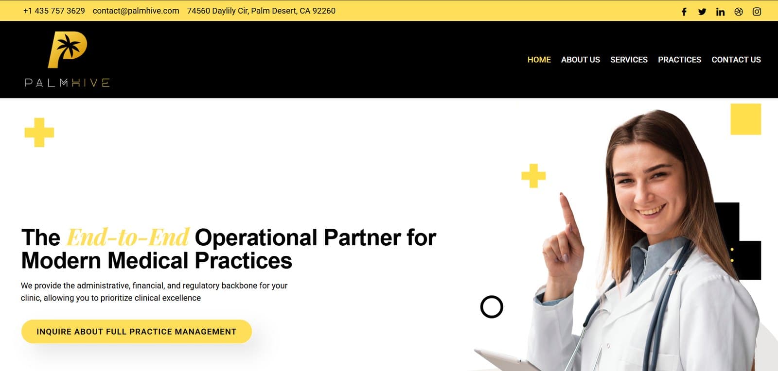
Brand identity and website for PalmHive, a Palm Desert practice-management firm that runs the admin, billing and compliance side of medical clinics — a gold-on-black mark that had to read as clinical and premium at once.
01 — The Challenge
A new firm entering a category where every competitor looks the same: blue, sterile, forgettable. PalmHive needed a mark that signalled medical credibility without becoming another stock stethoscope logo — and a site that read as a serious operational partner, not a clinic.
02 — The Solution
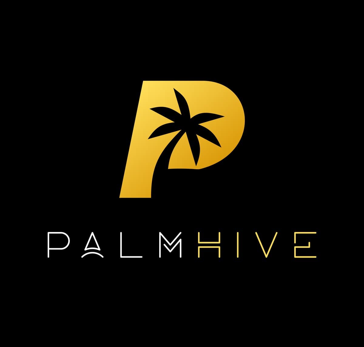
Worked through roughly ten directions in Figma — honeycomb cells, medical crosses, cross-and-hive hybrids — before cutting back to the simplest idea: the palm from the client’s own desert. The final mark carves a palm tree out of the counter of a P, so one shape reads as both the letter and the place. Gold on black replaces the category’s default blue, and the wordmark splits PALM in white from HIVE in gold. The site was then built and shipped on WordPress.
03 — Gallery

04 — Tech Stack
05 — The Result
Around ten logo directions explored before reducing to a single P-and-palm monogram
The palm sits in the counter of the P — letter and location carried by one shape
Gold-on-black palette deliberately breaks from the blue every competitor uses
Identity and full WordPress site delivered together in two weeks